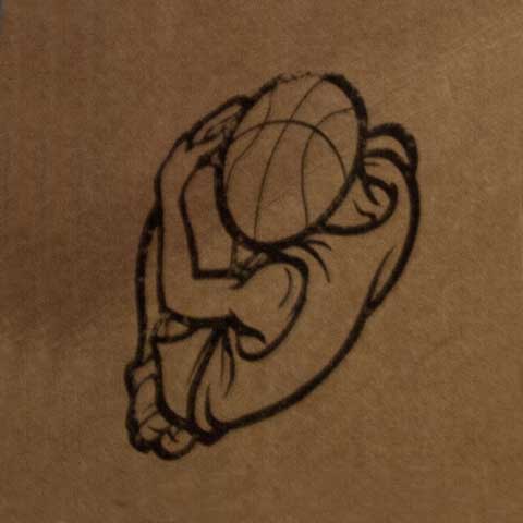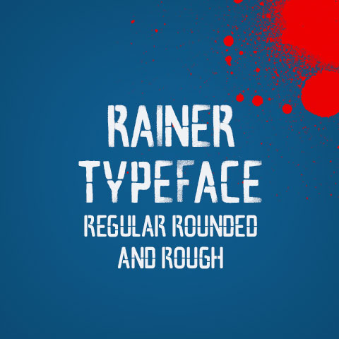
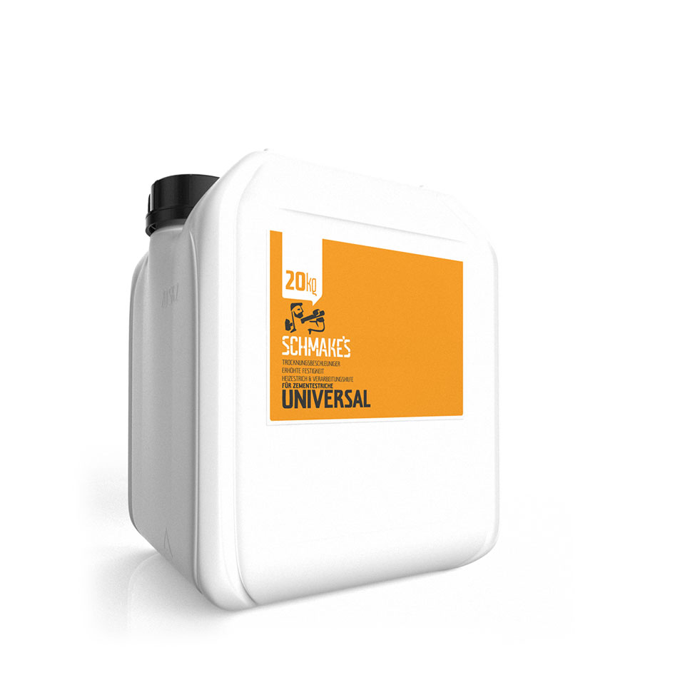
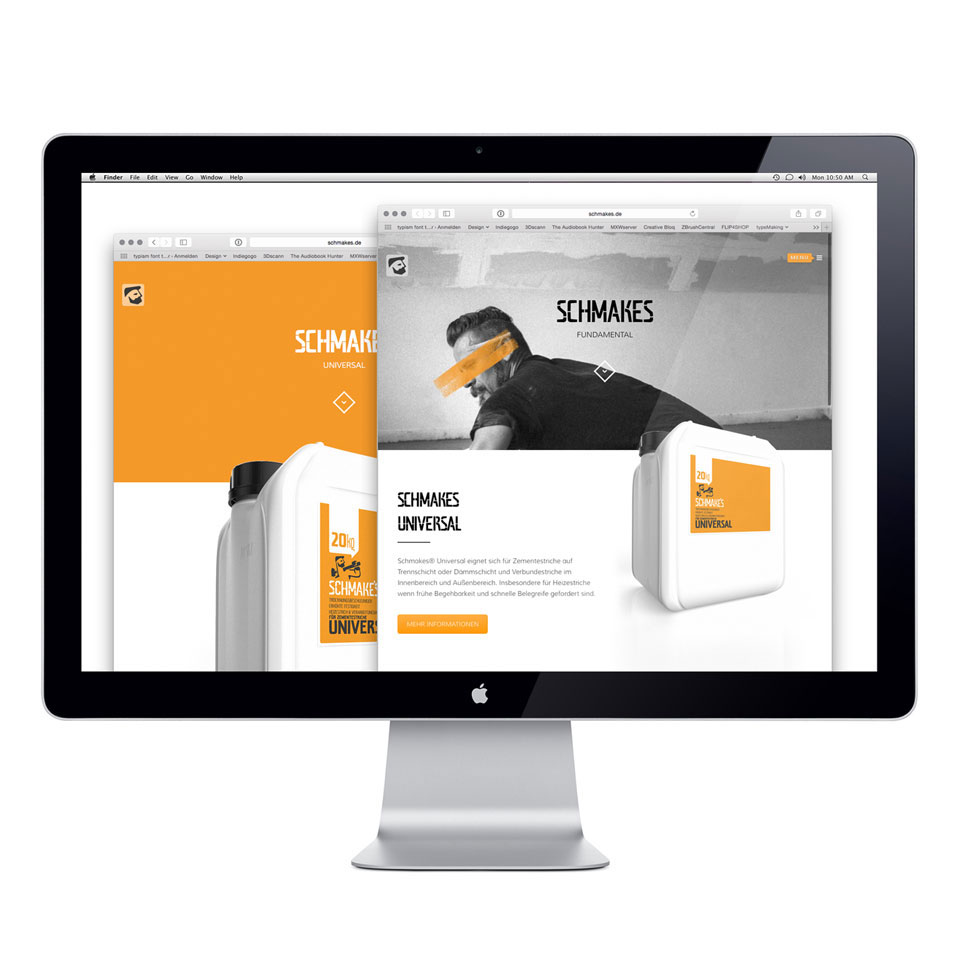


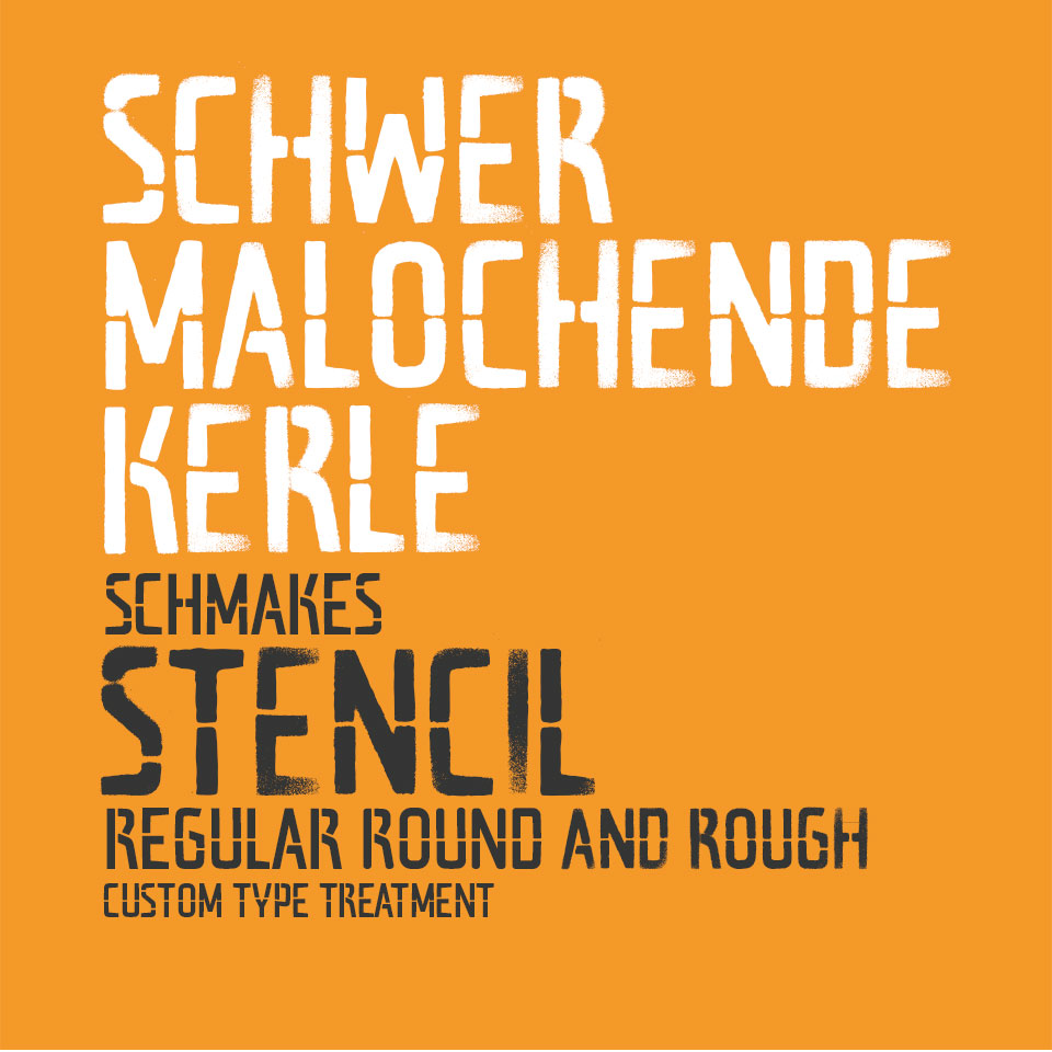


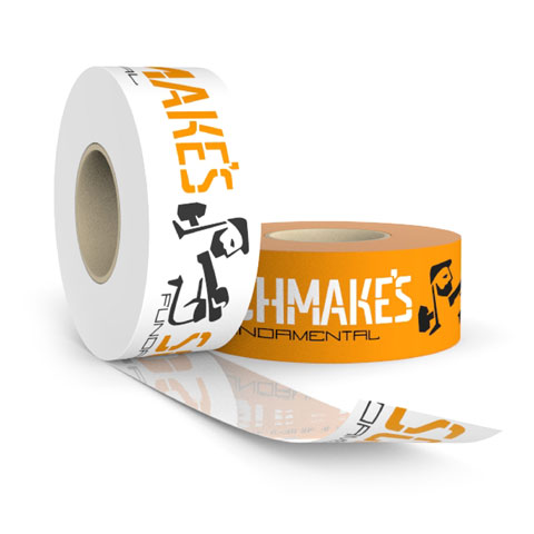
As a new company for building materials and ostrich supply, SCHMAKES wants to bring a perfect tool to the construction site. Main intend of their products is to make an hard labour a little more enjoyable. We developed the name using an idiom for „doing something with power“. The logo is based on an representation of an builder combined with logotype to emphasise the companies rough but honest approach. The colour scheme is chosen to gather the most attention on a construction area. Additional we developed an custom typeface to build headlines as needed same as icons and the basic packaging for the products.


